 M10 Docs
Knobs & Sliders Design
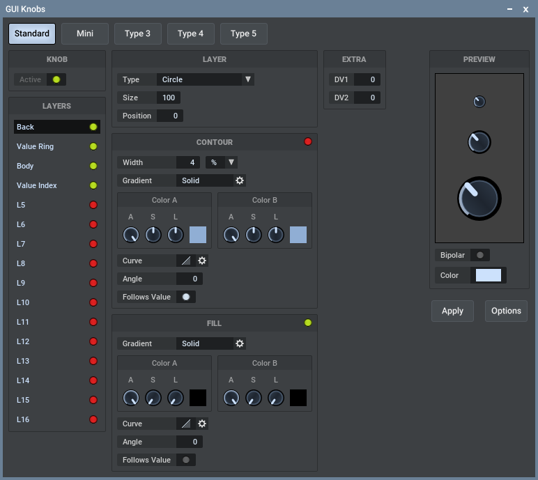
Via the main menu -> GUI -> Knobs / Sliders, you can design the used knobs and sliders.
Also the knobs and sliders in a front panel can be designed per front panel by doing Edit mode -> Right-click background -> Knobs / Sliders.
The following info is about knobs but it is all equal for sliders too.
More below are 2 sections one specific to knobs and one specific to sliders.
Which of the 5 knobs is used?
There are 5 knobs in a set: Standard - Mini - Type 3 - Type 4 - Type 5.
The standard knob is the main one and it's also used when other knobs in a set are inactive.
The "Mini" knob is just a hint that it's about a small knob, for example the pan knobs in a rack use "Mini" knobs.
Type 3 - Type 4 - Type 5 are generic type names and you can use these in MUX front panels as you want.
In front panels, you can choose the knob type for each and every knob.
Note that if you choose eg. "Type 3" but there is no active Type 3 knob in the front panel setup, then the front panel's "Standard" knob is used, if that's active.
If also the front panel's "Standard" knob is inactive then the global "Type 3" knob is used, if that one is active, else the global "Standard" knob is used.
The Editor
Each knob can consist of up to 20 layers. Each layer can draw a shape like a circle, an arc, a line, etc. Each layer can be switched on/off. You can drag layers up/down to change their order (drop in between 2 layers) or to copy them to another layer (drop upon another layer). Right-click a layer for its context menu, eg. to rename a layer.
The "Contour" is a line around the shape.
The "Fill" is about filling the shape.
Both contour and fill can use a color gradient that goes from color A to color B:
- Solid: The target is filled with solid color A only.
- Linear: The target is filled with a linear gradient from color A to color B.
- Radial: The more close to the center of the circle the more the gradient becomes color B.
- Linear-Radial: Similar to radial, but instead of a single center point, the center is defined by a horizontal line. By clicking the options button you can define the width of this line. If the width is 0 then the line is a single point and in that case Linear-Radial is exactly the same as Radial.
- Angular: The angle is used to crossfade from color A to color B.
The Curve defines how the specific gradient crossfades from color A to color B. A curve can even be repetitive.
The Angle of the gradient follows the standard math protocol:
0 degrees is at 3 o'clock. 90 degrees is at 12 o'clock, 180 degrees is at 9 o'clock and -90 degrees (270 degrees) is at 6 o'clock.
About Sizes
Sizes are expressed as a percentage of the total knob size.
So if a knob is 32 pixels, then a circle layer of size 50% will be 16 pixels.
The width of the contour can be chosen as a percentage or as absolute pixels.
About Colors
Knobs are designed with a certain preview color but the effective color is defined at the point where the knob is used.
For example the same knob design can be used for different front panel parameters and each of them can have a different color, even while it's the same knob design.
So the preview color is not the final knob color, it's just a color that is used to preview the knob design.
The colors in the Contour and Fill sections are defined by their A = Alpha, S = Saturation and L = Luminance.
There is no Hue value because, as mentioned above, the final coloring is applied at the point where this knob is used, eg. in a MUX front panel.
The little color preview field at the right of the A-S-L parameters is based on the preview color, again it's not the final color.
You can drag-drop these color preview fields to other A-S-L color sections to copy the A-S-L values.
You can also right-click that color field to copy-paste the color's A-S-L values and paste it into another A-S-L color field.
Knobs
Knob gradients also have a Follows Value switch and when it's on the Angle will follow the knob value.
Knobs have a range of 290 degrees.
Sliders
Sliders also have 2 main properties which are common to all layers:
Handle Area Size defines the area in which the handle operates. When it's 100% then the full slider area will be used, but you can lower it a bit to create some margin.
Handle Size defines the main size of the handle itself.
Each Value Handle layer also has a Size property which is a percentage of this main handle size.
This way you can build up a more complex slider handle by using multiple partial handle layers.
For example: If you set the main Handle Size to 16% of the total slider size, and a certain Value Handle layer to size 50% then that layer handle size will be 8% of the total slider size.
The Width of a "Rect. Value Handle" is a percentage of the total slider width.
It is ensured that if the width is lower than 100% (eg. 99%) then the effective width will at least be 2 pixels less than the total width, 1 pixel at each side.
If you want to copy a horizontal slider design to a vertical slider design, or vice versa, then use "Save Preset" to save the source slider design and "Load Preset" to load it into the target slider design.